Client
Rimini Pizza
YEAR
2025
Skills & Deliverables
Identity / Brand Applications

Overview
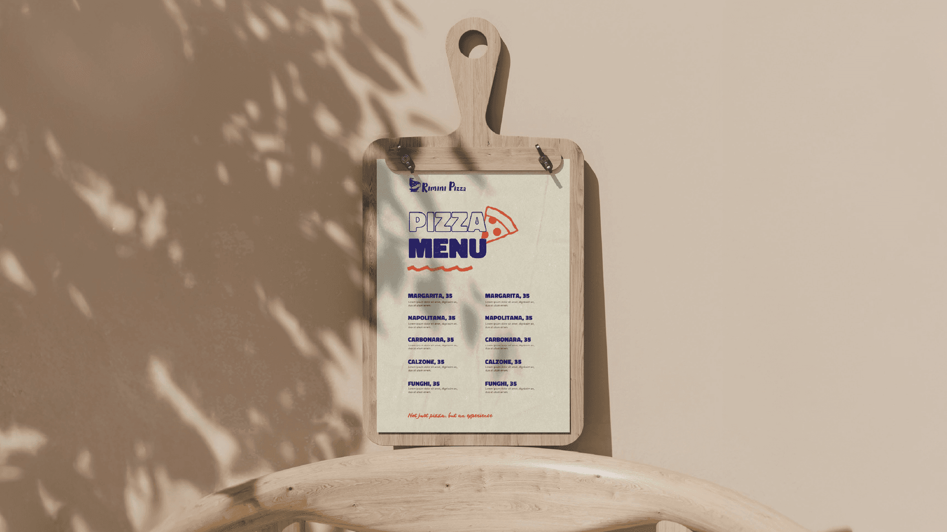
Both directions were developed across typography, color, graphic elements, packaging and outdoor applications, exploring how the identity could evolve into a more cohesive and recognizable brand system.

I.
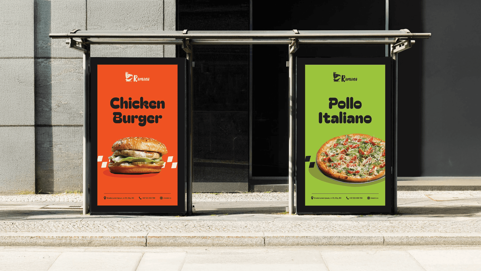
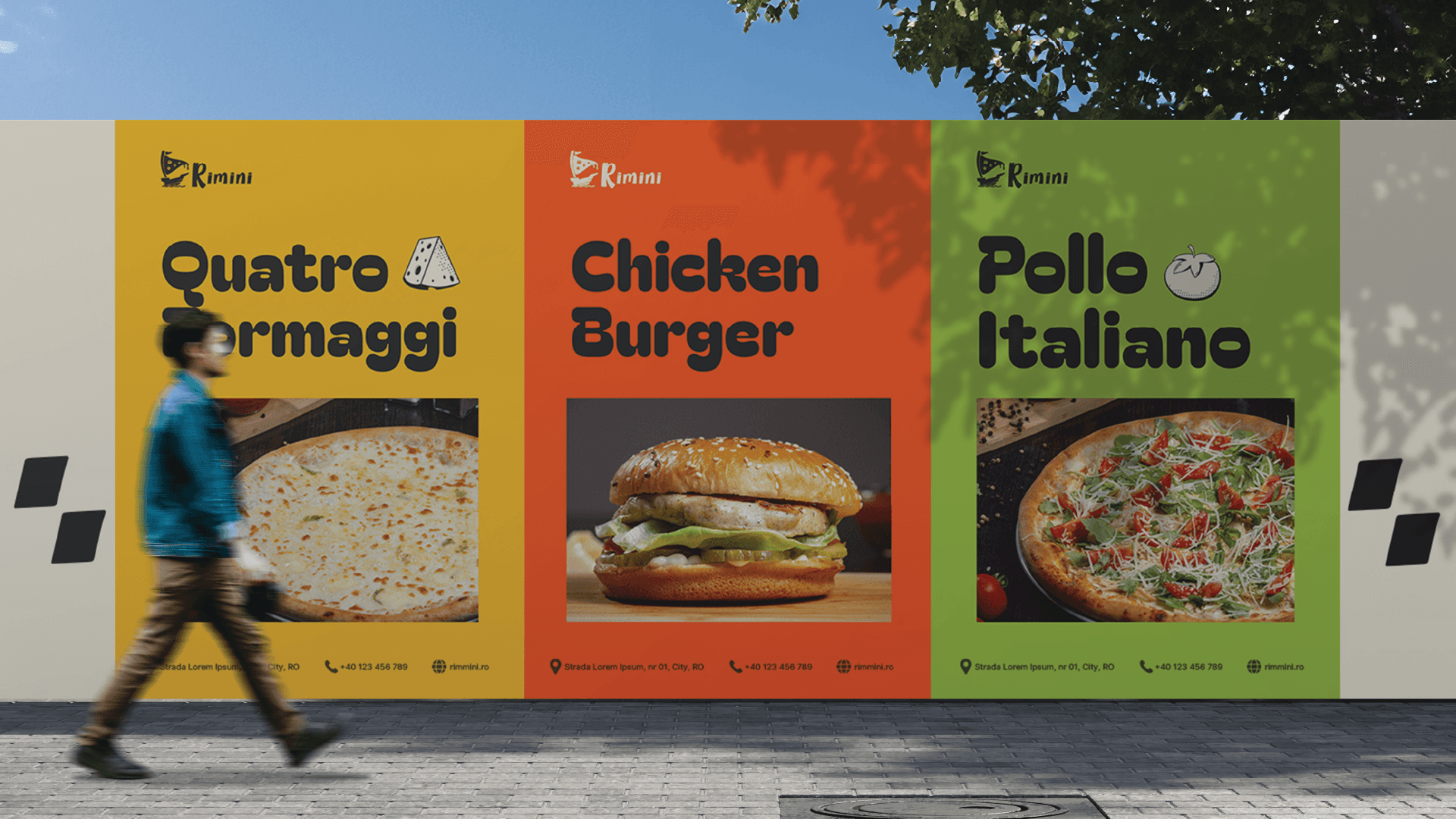
This direction builds on the original logo through strong typography, vibrant colors and simple graphic elements.





II.
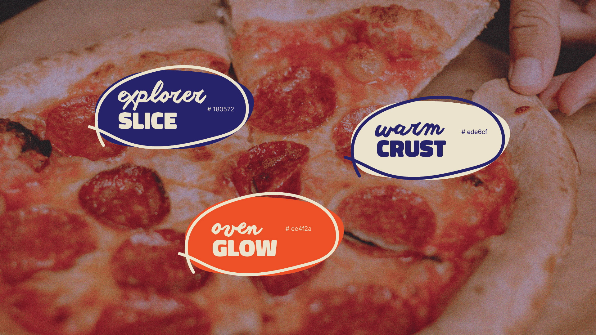
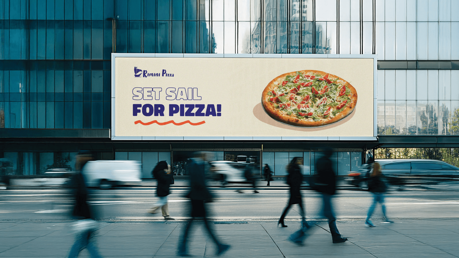
This direction takes the pizza-slice-and-ship symbol as the main creative starting point, transforming its shape into a broader graphic language.




a.apalaghiei@gmail.com