Client
Salsa
YEAR
2021
Skills & Deliverables
UX Strategy / UI Design & Prototyping
Overview
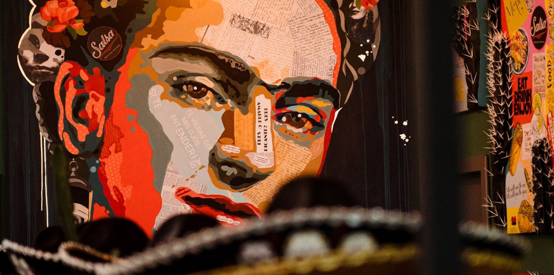
Salsa is a Mexican restaurant that offers a diverse menu inspired by traditional Mexican cuisine. As the restaurant expanded its digital presence, the website became an important touchpoint for customers looking to explore the menu, discover promotions, and place orders online.
Objective
In this project, I focused on redesigning the website experience to improve usability, simplify navigation, and create a stronger connection between the brand's vibrant personality and its digital presence.
Before & After
Website Audit
Reviewing the existing website, the audit highlighted several usability challenges related to navigation, content hierarchy, and product discovery.
The single-page structure made it difficult for users to browse information efficiently, while the visual design lacked a distinctive brand presence.
The Before
Main usability issues
• Limited brand identity
• Single-page menu requires excessive scrolling
• Repetitive layout creates visual fatigue
• Product information competes for attention
The After
Key improvements
• Stronger brand identity
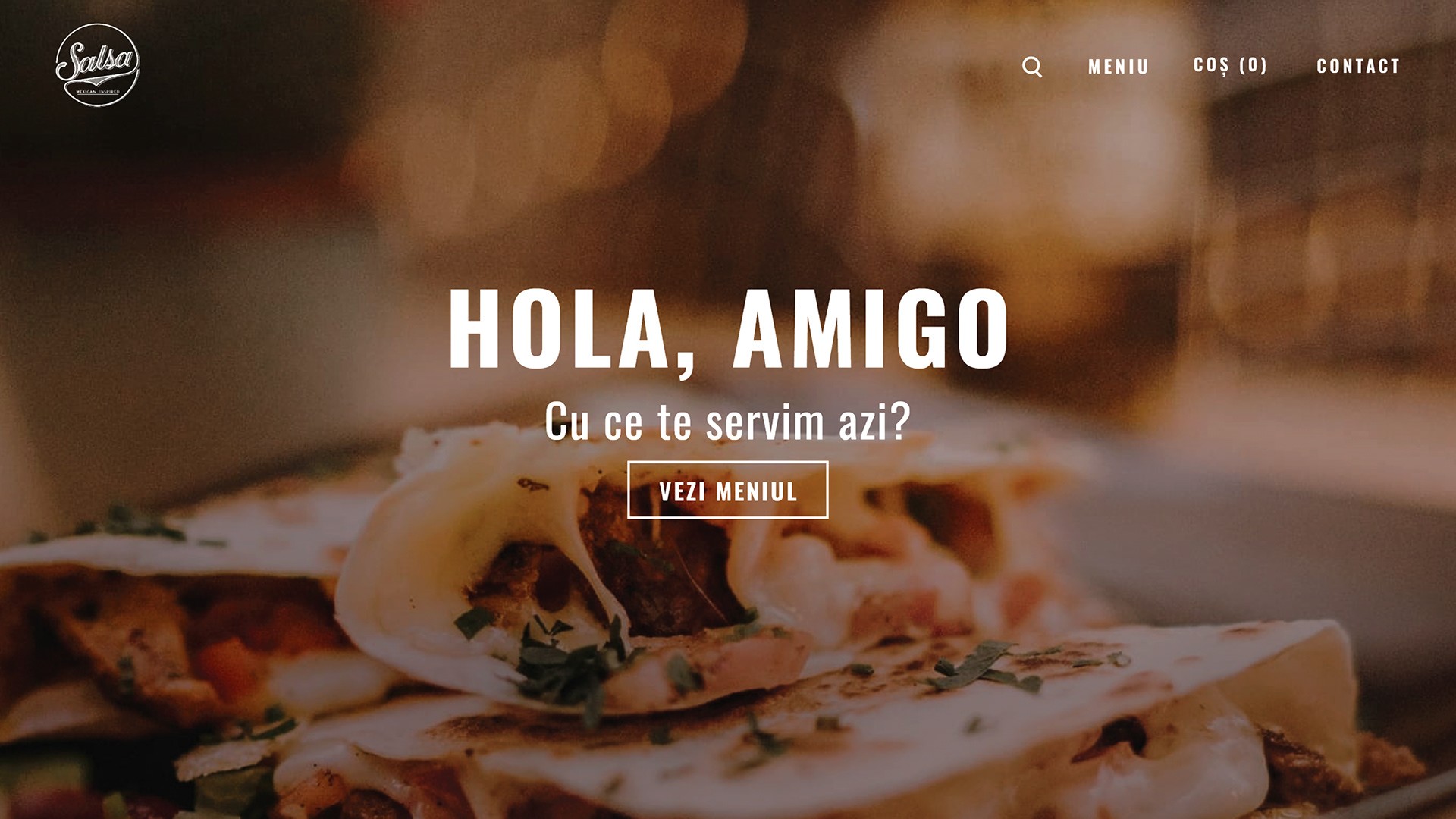
• Clear homepage structure
• Dedicated menu browsing experience
• Improved information hierarchy
Research insights
Competitive Analysis
I analyzed several restaurant websites to understand how they communicate their offerings and guide users through the browsing experience. The most successful examples relied on strong visual hierarchy, appetizing imagery, and well-structured content to create an immediate sense of trust and encourage exploration.
Design Opportunity
The research revealed an opportunity to redesign the menu experience by making navigation more intuitive, improving product discovery, and reducing the effort required to browse a large menu.
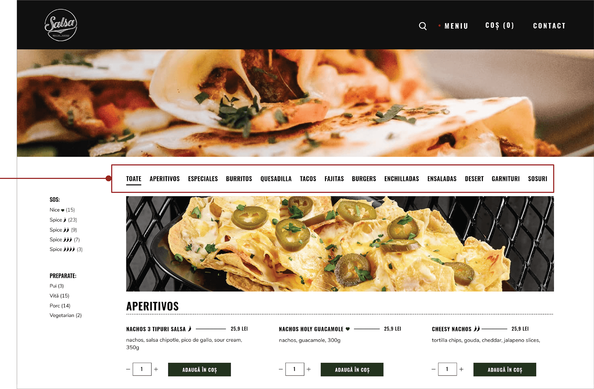
• Category tabs make switching between sections effortless
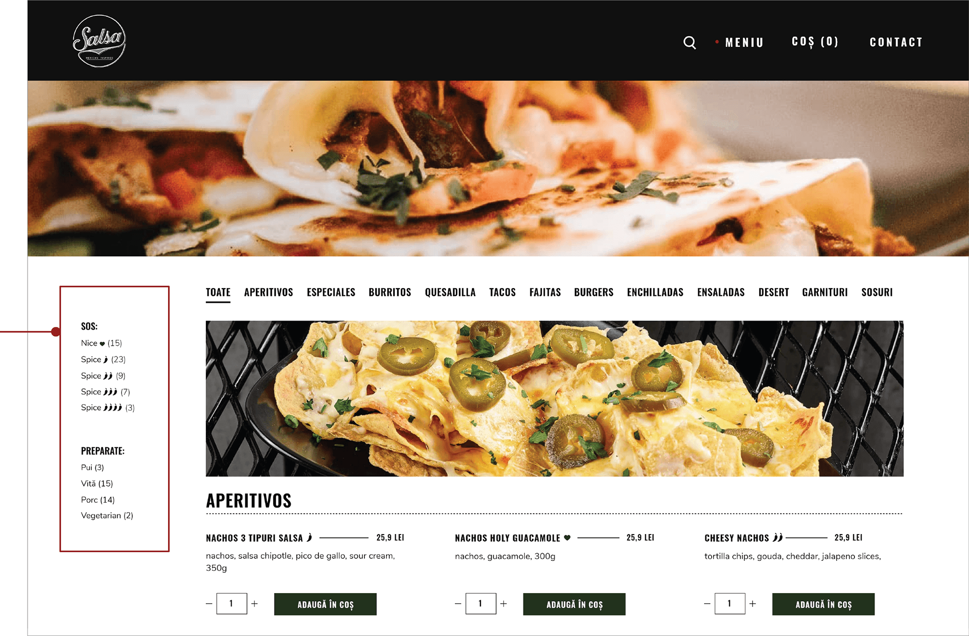
• Ingredient and spice filters help users quickly narrow down relevant dishes
Main user flow
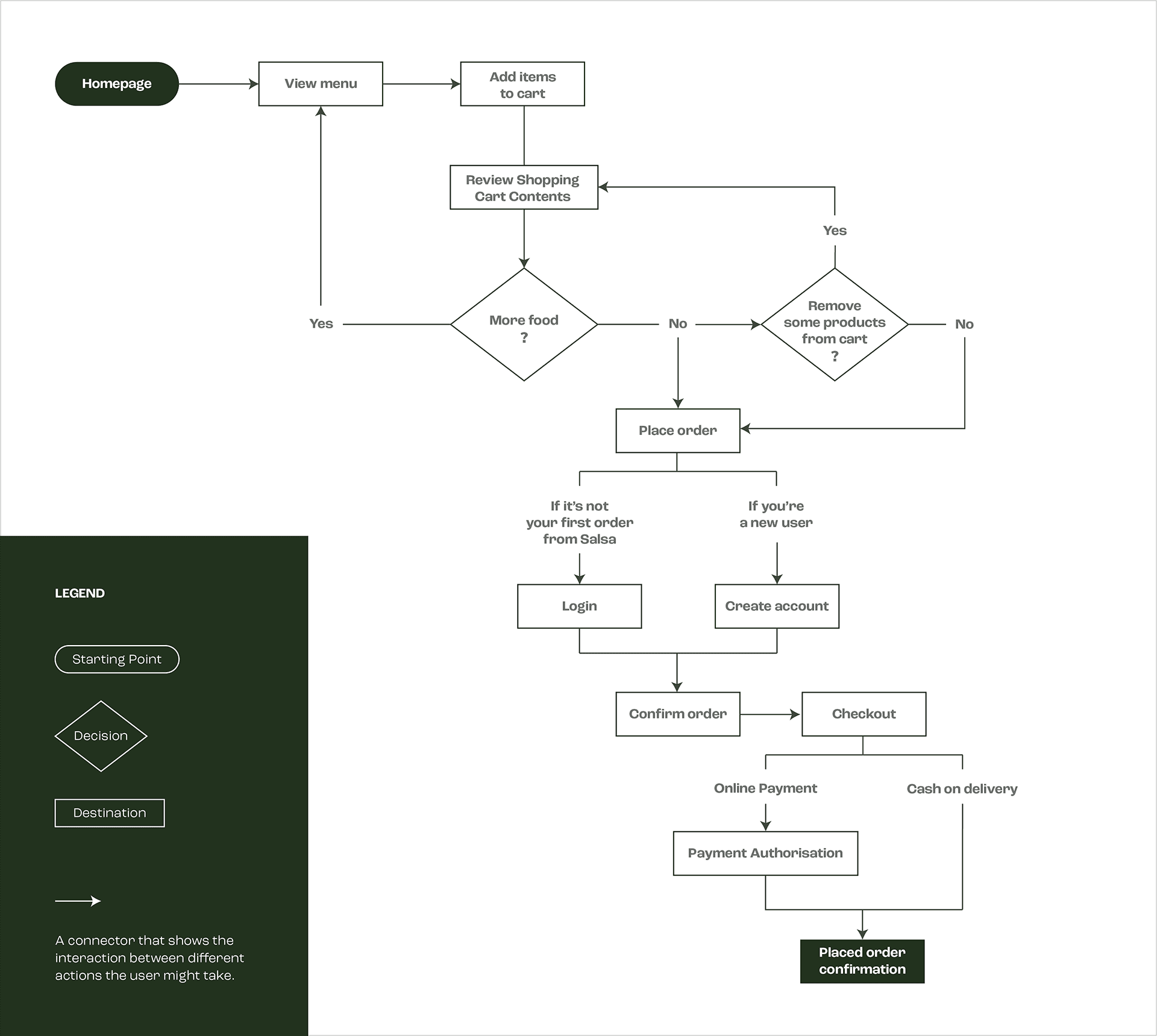
The user flow focuses on the restaurant's core user goal: ordering food online. Mapping the journey helped simplify the checkout process, clarify decision points, and create a more predictable experience from menu discovery to order confirmation.
Menu Exploration → Product Selection → Cart Review → Checkout → Order Confirmation
FInal outcome
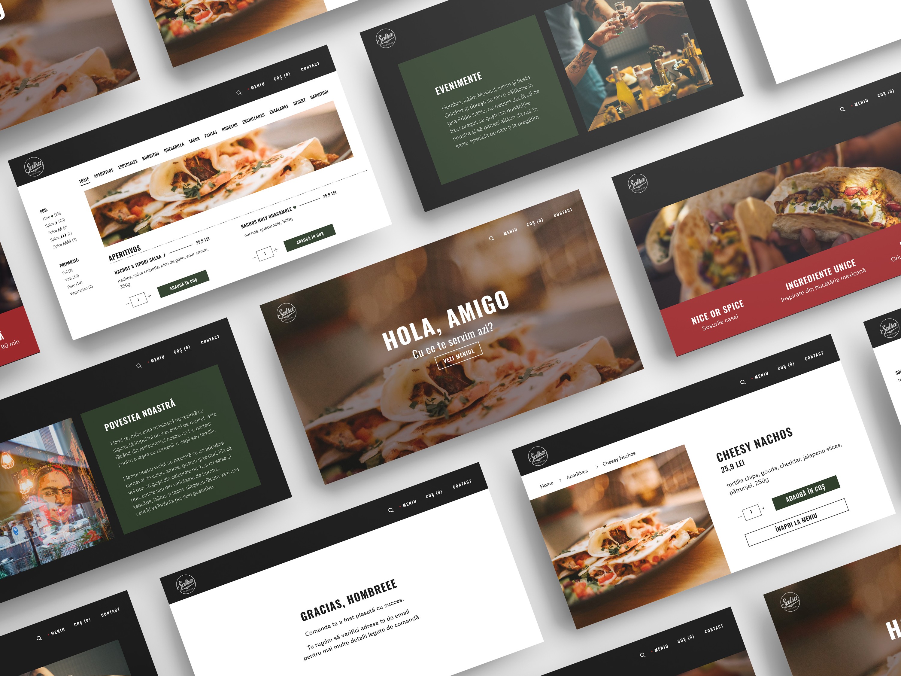
The redesign resulted in a more structured and visually engaging experience, with a clearer content hierarchy and a simplified ordering flow.



a.apalaghiei@gmail.com