Client
sTomato
YEAR
2025
Skills & Deliverables
Brand strategy / Visual identity & Logo design

Overview
This rebranding project explores the repositioning of sTomato, a B2B digital platform for dental professionals, with the goal of repositioning it as a credible healthcare technology brand, moving away from an overly playful visual identity.
Strategic Approach
The previous visual identity, centered around a green tomato symbol, unintentionally communicated associations closer to a grocery product rather than a professional medical platform.
This created a disconnect between the product’s value proposition and its perceived level of trust and expertise.
The challenge was creating a visual identity that felt professional and medically credible, while still remaining modern, approachable, and distinctive within the healthcare space.

Insights
Behavioral Insight
In healthcare branding, trust is strongly influenced by visual clarity. Literal or playful symbols can weaken credibility, especially in B2B environments where expertise and reliability are key decision factors.Product Opportunity
Redesign the brand identity into a more structured and professional visual system aligned with healthcare standards.
Visual system
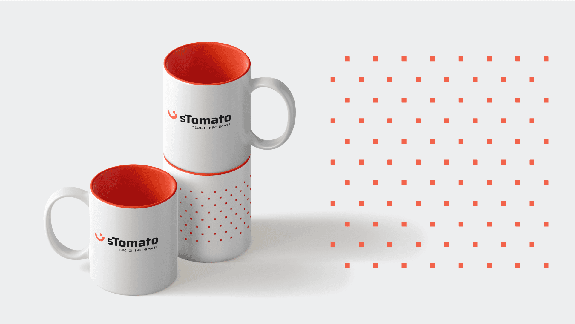
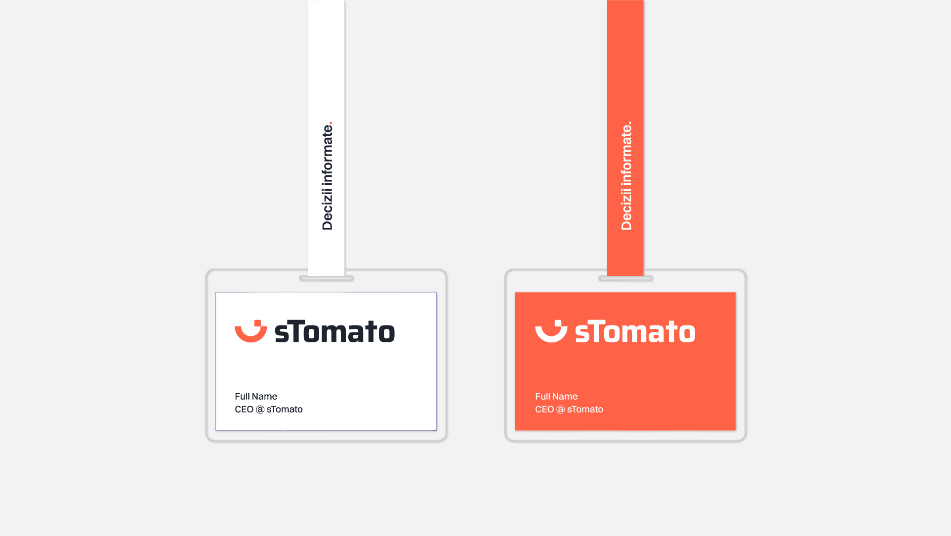
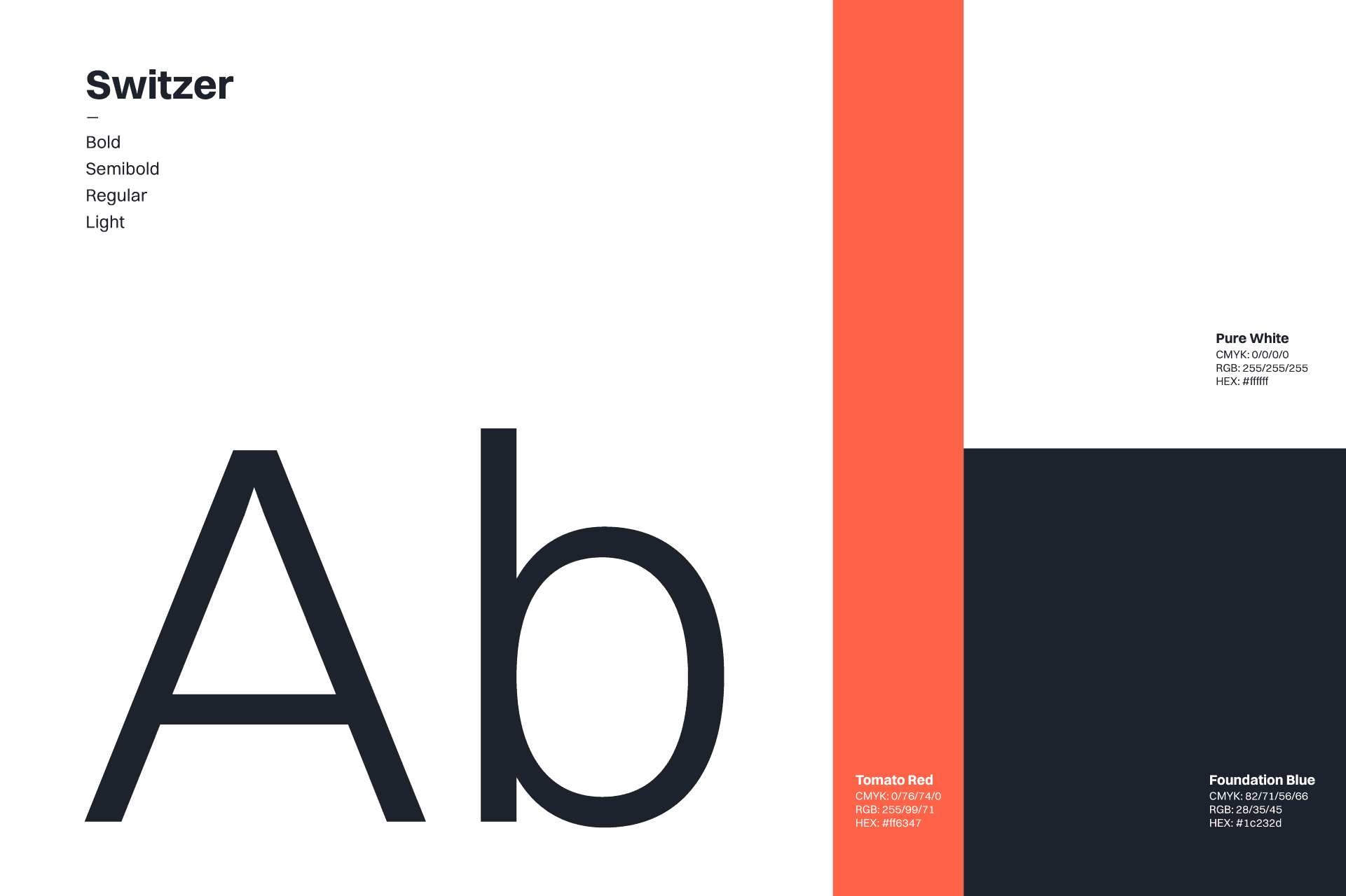
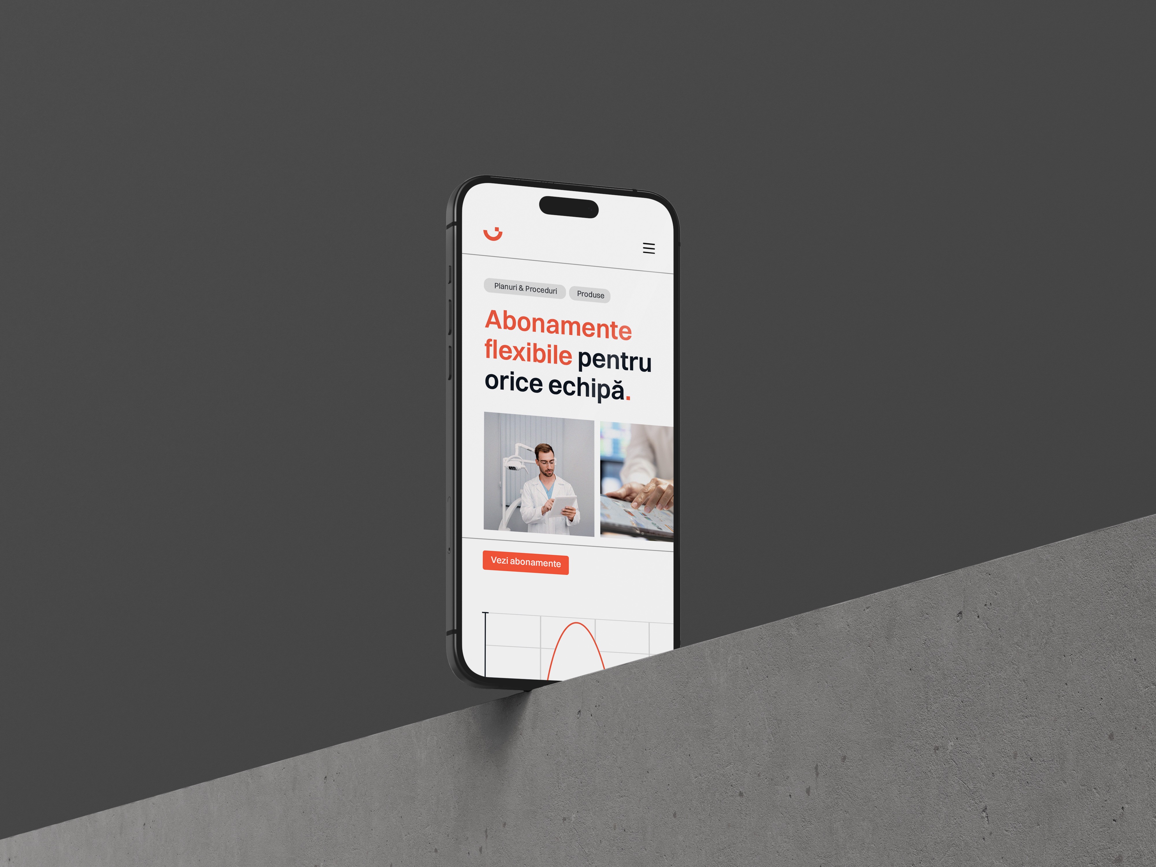
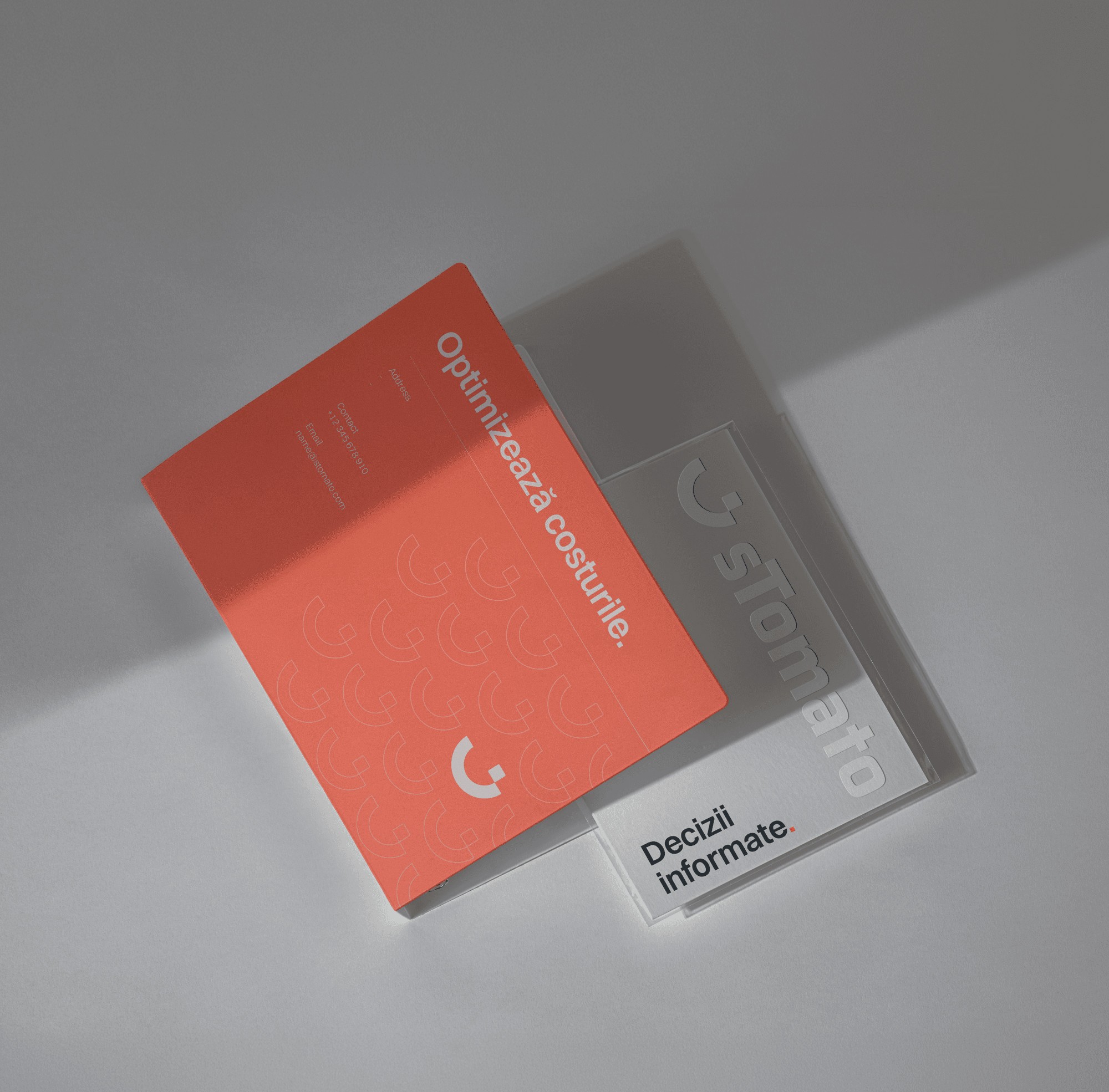
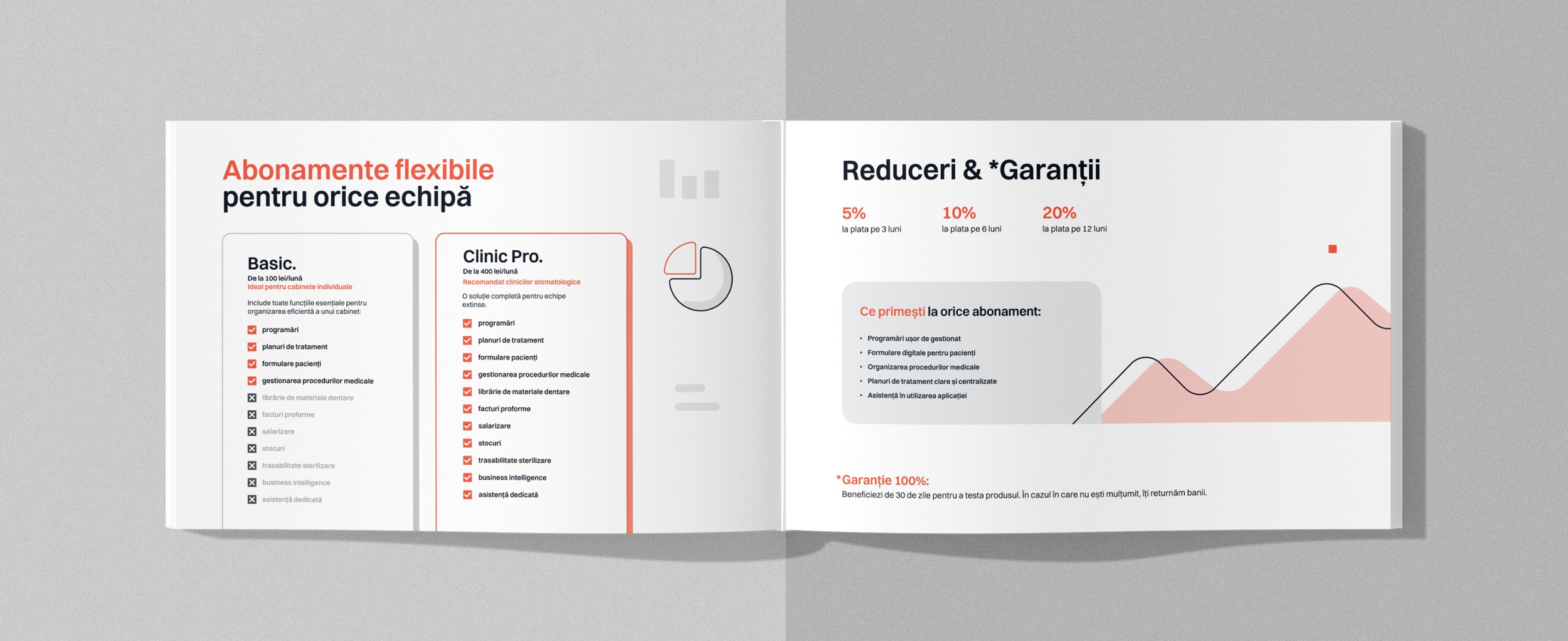
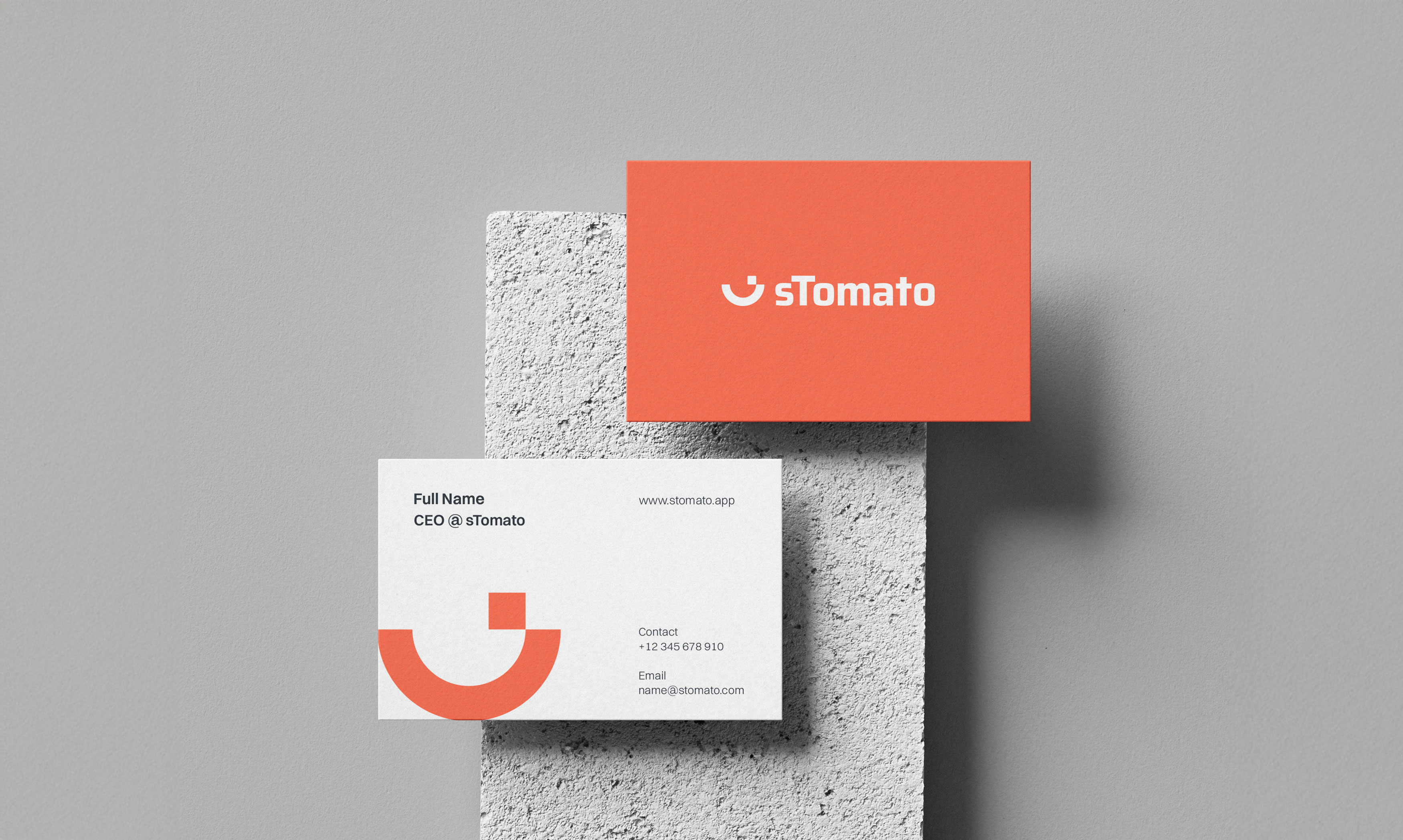
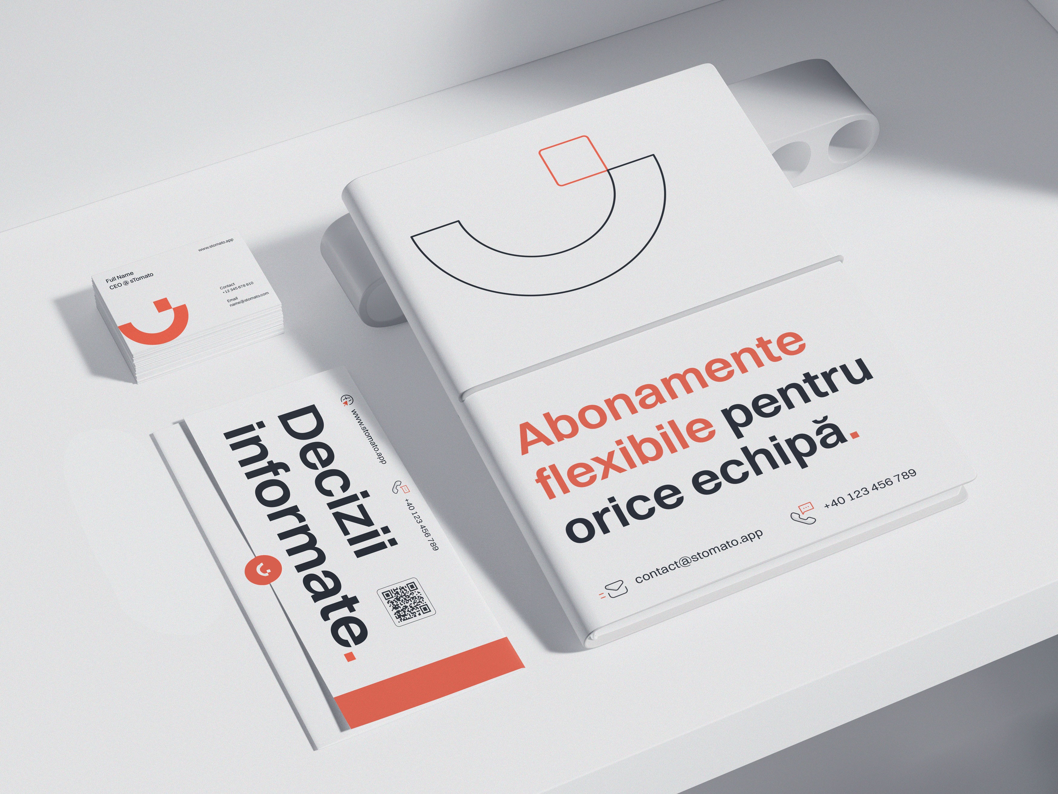
The final identity is built around a simplified smile-based logo that reflects both the dental context and the idea of a completed process. A distinctive detail in the logo references a functional unit - a small element that makes a difference within a well‑calibrated system. Rather than directly representing the “sTomato” name, the design maintains a subtle connection to its original tomato concept through a reinterpreted color approach.
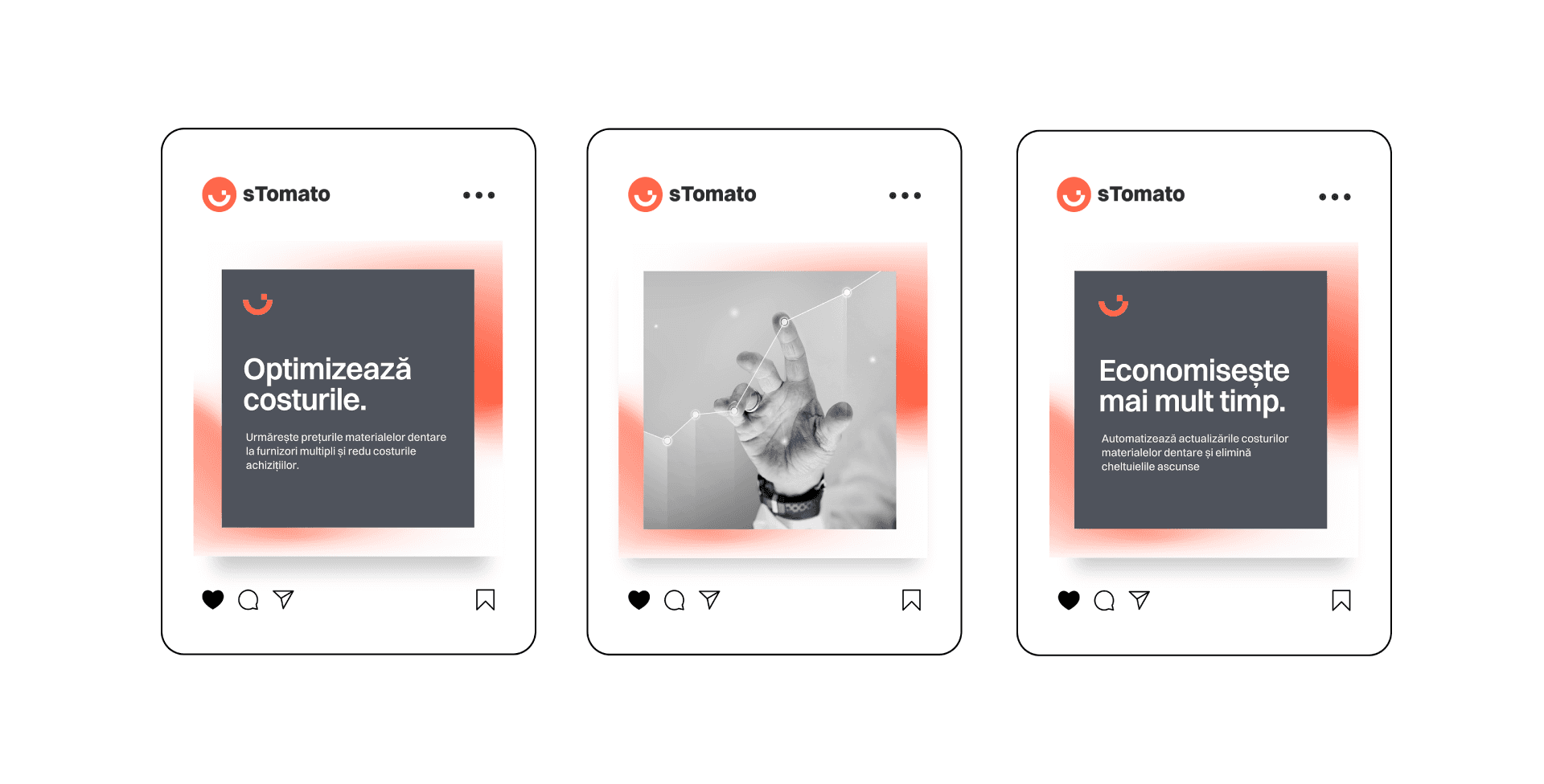
The result is a cohesive visual system that supports a clear B2B healthcare positioning.





a.apalaghiei@gmail.com